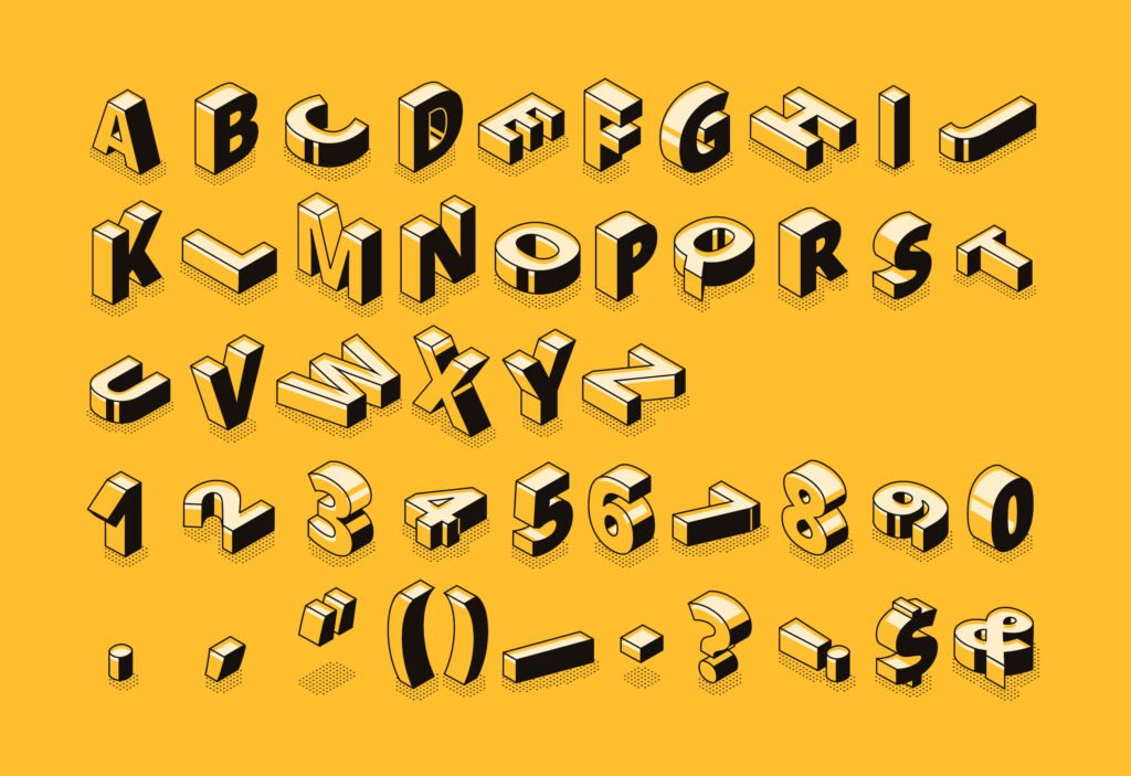
The Impact of Typography on User Experience

In digital design, typography does more than display text; it plays a crucial role in shaping the user experience (UX). Choosing the right typography can help guide users, evoke emotions, and influence how content is perceived. This blog explores the impact of typography on user experience, including best practices to enhance readability, accessibility, and overall user satisfaction.
Why Typography Matters in UX
Typography contributes to the usability and aesthetics of digital content, influencing how users interact with your website or app. It does this by:
- Affecting Readability: Fonts, line spacing, and layout impact how easily users can read and understand content.
- Guiding Attention: Headers, font size, and weight help structure information, making it easy to find what’s most important.
- Conveying Emotion: Fonts communicate mood and tone, setting the stage for how users interpret information.
Key Elements of Typography That Affect UX
1. Font Choice
The choice of font has a profound impact on a user’s perception of content. Here’s how to make effective choices:
- Sans-Serif vs. Serif: Sans-serif fonts (like Arial and Helvetica) are clean and modern, often preferred for digital interfaces. Serif fonts (like Times New Roman), with their added strokes, are considered more traditional but can add a level of sophistication.
- Custom Fonts: Unique, custom fonts can reinforce branding, though they need to be legible and harmonize with the overall design. Overly decorative fonts should be used sparingly to maintain readability.
2. Font Size and Weight
The font size and weight can influence both readability and hierarchy, helping guide users naturally through content:
- Hierarchy: Larger fonts for headers and smaller fonts for body text establish a visual hierarchy. Users can easily scan headers to locate sections of interest.
- Emphasis: Using bold or heavy fonts for essential content can draw attention to specific elements, while lighter weights are ideal for secondary information.
3. Line Spacing and Letter Spacing
Proper spacing is essential for readability and aesthetics:
- Line Spacing: Also called line height, this refers to the space between lines of text. Too little space can make content feel cramped, while too much can cause the text to feel disjointed.
- Letter Spacing: Increasing letter spacing (kerning) can improve legibility, especially with larger text or uppercase letters. However, too much spacing can lead to readability issues.
4. Color and Contrast
The colors used in typography should be easy on the eyes while still being distinctive:
- High Contrast for Accessibility: Adequate contrast between text and background is essential for readability, particularly for users with visual impairments.
- Color Psychology: Colors convey meaning and emotions. For example, red is often associated with urgency, while blue conveys trust. Choose colors that align with the message you’re trying to convey.
5. Alignment and Layout
Alignment and layout impact how users flow through content:
- Alignment: Left-aligned text is generally easier to read, while center-aligned or right-aligned text should be reserved for specific purposes.
- White Space: Adequate spacing around text creates a clean layout, helping users focus on the content. White space also prevents visual clutter, improving comprehension.
Best Practices for Using Typography to Enhance UX
Prioritize Readability
- Use legible fonts and sufficient font sizes (16px or larger is recommended for body text).
- Avoid using too many font styles on a single page; stick to two or three fonts to maintain cohesion.
Optimize for Accessibility
- Ensure high contrast between text and background. Tools like WebAIM’s Color Contrast Checker can help.
- Avoid excessive italics or script fonts, as they can be challenging for users with dyslexia or vision impairments.
Create a Clear Visual Hierarchy
- Use larger, bold fonts for headers to make content easy to scan.
- Make essential information stand out with bold or colored text to guide users.
Use Consistent Typography Across Platforms
- Ensure font choices are consistent across devices and screen sizes. Responsive typography scales fonts proportionally for smaller or larger screens.
- Test on various devices to see how typography elements like font size, spacing, and layout impact readability.
Experiment with Minimalism
- Minimalist typography eliminates unnecessary decoration, allowing users to focus on content. Simplicity in font choice, color, and spacing can improve the overall UX.
Examples of Effective Typography in UX
Apple’s Website: Apple uses a minimalistic approach with high contrast and simple sans-serif fonts. Clear headers guide users while adequate spacing ensures readability, creating a sleek and polished experience.
Medium: Medium prioritizes readability with a consistent typeface, large body font size, and spacious line spacing. The platform’s typography is optimized for long-form reading, with clear headings and ample white space.
Airbnb: Airbnb’s typography combines custom fonts with high contrast and thoughtful use of color. Headers are bold and spacious, with readable body text, all contributing to a clean, professional design.
Conclusion
Typography is a foundational element of UX design, going beyond aesthetics to impact how users interact with digital content. By selecting fonts carefully, establishing a clear hierarchy, and optimizing readability, designers can create engaging, accessible, and visually appealing experiences. Remember, good typography subtly guides users, ensuring that content is not only readable but enjoyable and memorable.


